Showing posts with label publishing. Show all posts

Thursday, August 28, 2014

Now We're Almost There

Alright, it is August 28th, and the project has almost reached it's exciting finish. I can now safely say that I have created 25 copies of my book. It was a big crunch to get everything done before heading to Calgary for the last week of August, and I didn't quite make it; there is still some final gluing that needs to be done in the next couple of days. That said, the text blocks for each book have been folded into single signatures, bound and editioned, and the covers are folded and ready to be glued.


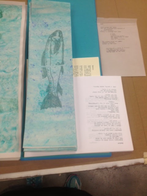
Using screen printing has been a really interesting way of making this project happen. Initially I was going to do the whole book in "duo-tone", meaning I would be using two layers of ink. After, doing some tests of the second layer of ink I decided to keep this only for the images because properly registering all of the pages of text would take more time and paper than I have. Mostly paper. Have I mentioned this before? I know I have. Starting any printing project means using way more paper than you would expect. Doing the whole book in duo-tone would mean making twice as many first layer prints or more with the expectation that on the second layer, I would probably waste half of my attempted prints. Anyway, here is a quick pick of how one of the images turned out.


After getting everything folded, I bound the signatures using a 3 hole bookbinding stitch, using bookbinders thread. Super simple but it did the trick.


The outer sheet of the signature will become the inner part of the cover once the books are all glued together. Here, I used some beautiful mulberry paper for two reasons: 1) it is super pretty (obviously!) and 2) Mulberry paper is really strong and archival quality. This is because the mulberry fibers that are used to make the paper are very long. Because this paper comes in the wrong size for what I was doing I had to trim the paper. I did this using water and tearing it rather than cutting it to size because I wanted to keep the nice edging on the paper. 

I also glued the covers together, so now they are are all ready to be put together with the text block. To do this, I used some small Litho stones that we have in the print shop for weight. 


Tomorrow, I will be heading back to Kelowna and back to finish with the final gluing of everything. Onwards!


Wednesday, August 6, 2014

Book Binding At Long Last!

At last! I have reached the Promised Land! Today is most definitely the first day that I have really felt like I am making books. Now that I have gotten together many of the materials that I need, and I know which direction (sort of) that I am going in, I can start actually making books.

Today, I assembled two different books, filled with blank paper to practice before I settle on a design and work away at the text blocks to fill them. As I mentioned in my last post, I will unfortunately have to give up the ghost of lead type for my text block. Instead, I will be doing the entire book using screen printing. The initial image of the text will be designed and typed on a typewriter and then transferred to screen... but that whole hurrah will be discussed in a different blog post!

The first book is a folded "soft-cover". The cover is made with a light card, called Casan Mi-Teinte turquoise, that I folded and attached the would be text block (in this case blank pages) to. I cut and pasted one of the screen print fish that I designed for the cover onto the card before folding.


The important thing with this type of cover design is that you want the length of the paper that will become your cover to be twice the length of the final cover size so that you can for it in on itself. I wanted my cover to be 12" X 9" so the paper that I am using in this pic is 24" X 9". Make the first fold directly in the middle of the paper. Next, measure and mark 6" from the center fold on either side. Fold where these marks are "hamburger"-wise as the kids say, or in layman's terms parallel to the first fold. This is your cover.


 Next, you get the "text block" ready. I did this binding the text pages together, or the guts of the book shall we say, using a simple 3 hole pamphlet stitch. You can find super easy instructions for that here (this is the site I used!).


Finally, take your guts and glue them to the two inner flaps using pH neutral binding glue. (The glue is important because other things will degrade over time eating away at the paper and all your hard work). The inner sheet that I used was a scrap of mulberry paper.

After all that's together, you may also want to press the book under something heavy. Unless you happen to have a bookbinding press lying around, which we just happened to have at UBCO, you can really use anything heavy for this: a cinder block, Michelangelo's David, you know, whatever you happen to have kicking around that will allow it to lie flat between two flat surfaces that cover the entire thing with pressure. If it's not totally covered you might end up with some kinks in your beautiful cover and we can't have that now. 

As for the learning experience today, I will be doing some more screen printed fish in a lighted contrast with more translucent ink to see how they look compared to the stark grey and black I used on the last ones. Also, I have come to the conclusion that I will be doing two editions of the book... one soft-cover and one hard cover. Stay tuned for next time when I explain how I will be constructing the hardcover versions of my book!


Tuesday, July 29, 2014

Printing Experiments Part 1: The Adana

This summer has been an adventure in the realm of bookmaking, and, as per the norm of my blogging aspirations, I have not been recording them to the best of my ability!

The last few weeks I have had the absolute pleasure of working with lead type at UBC Okanagan's campus. UBCO is home to both Briar Craig (from whom I was able to post snippets of an excellent conversation we had in an earlier blog post) and an Adana model M0120-M0125 printing press.


But before I could really get started with using this little beauty I had to go about organizing some of the new type that I was thinking of using (Neon Century Schoolbook 12pt) into a type drawer. There are different ways of organizing your standard type drawers. One of the most common arrangements is the "California Type Case" that is set up as follows: 


So, I went about organizing the new set of type into a drawer. Interestingly, word "Neon" in the title of this font is an indicator of the specific typesetters that designed the font -- in this case the Chicago Typesetters. The word neon was added to the title to avoid copyright infringement on type of similar design. Our print shop at UBCO has both Neon Century Schoolbook and Neon Helvetica (both in medium 12pt as well as a set of Neon Helvetica 24 pt).


Once this was done I could start setting type. At this point a typesetter starts to set the type using a composing stick. Like this:


On the bottom, ledge part of the composing stick the typesetter first needs to put down a "slug". The slug is a piece of lead that the type is set onto. It acts as the spaces between lines and stops the letters from falling all over the place when you move the type off of the composing stick and into the chase. The chase is a metal square that the type is set into and tightened using block of strong wood (like oak). 

Setting the type and getting it to stay in the chase takes a long time, and this particular model of letter press can only do about a half letter size page of text. Which is fantastic, if you have a lot of time -- like a lot of time. It takes about 4-6 hours to set a page of type, and proof it. It takes another fair chunk of time to get the machine properly set to print consistently, through the use of rigging up bits of paper and other little shims and things to get all of the letters to print, and finally, printing your finished copies. That's the easy part, once you have done all that set up, printing on the final sheets of paper is a breeze... providing you get everything all inked up properly.

For my test run, I decided to print one of the poems from the book I am publishing for this project, called String Men. Here's a sneak peak! 


After creating the mock up for this project, I have organized my twelve poems so that I will be printing a text-block comprised of 24 pages. A 24 page text block breaks down to 12, 2-page plates, with 2 plates on each sheet of paper. Which means that the text block will consist of 6 sheets of paper. This is a huge endeavor for a little press. Setting one day per page and printing one day per page means, 2 days for each page. Meaning the shortest possible print time is 48 days. Based on this, the next thing that I am going to try is to convert the print studio etching press into a flat bed press. 

Stay tuned for Printing Experiments Part 2: Converting an Etching Press!  


Tuesday, May 13, 2014

Death & The Future of Publishing (my summer project)

The future of the book is tenuous these days; The advent of e-books have created a publishing climate where anyone can publish books with a wide distribution for little to no cost. I, as a hopeful writer, and aspiring publisher have been bombarded by cries of "publishing is dead", and sure, things cannot go on as they are in this world with everything growing, and changing in the technological storm of capitalist consumer culture, where one technology is dead in a year or two, to be replaced by a completely different beast of circuitry that is incompatible with it's last incarnation. 

However, I have heard these death knells before: Punk is dead; Poetry is dead. All my favourite things, it seems, are mostly dead, and that doesn't change how lively they appear at the punk shows and poetry readings that I attend. Leaving punk and poetry aside for another day, another essay perhaps, and returning to publishing, I can't help but think that the idea of death is merely the recognition of change. Truly, we have set a course in publishing where we can never go back to the mass production of pulp romance that we have had in the past, and truly, the e-book in these circumstances are a superior technology to the old ways. 

This technology, useful though it is, does not take into accounts the human desire for physical objects. We humans spend most of our lives amassing a wealth of objects through which we define ourselves. (My dear friend and fellow poet Kale Greenfield has a poem about this that has been published in a few zines and chapbooks this year called "The House, The Car, The Things" that captures this perfectly.) Books are very much a part of the need for aesthetic pleasure derived of objects, and it is very unlikely that any e-reader, no matter how fancy the cover or how high the quality of the screen, will be able to give me the same feeling that I get from the feel of a book. 

So, where are we going exactly? What is the future of publishing?

My bet is on the divergence of the publishing industry into two paths: consumption and art. As I mentioned earlier, there are distinctly areas that benefit from the mass effectiveness of e-books. There is a whole market of people that read a book once and never pick it up again. Libraries benefit because there would never be such a thing as a lost book again. This is the place of consumption. It is entertainment and there is nothing wrong with it. The consumption path brought us Netflix, changing the way we consume T.V. and movies forever. This is the home of the e-book and it belongs there.

Moreover, it is the second path that I am most interested in: Art. Art is the place of the concept. It is the home of deep thought. This is where poetry lives and as a poet I know that this is the future of the printed word, in aesthetics and object glory. The path of publishing is bound to open up into the world of the fine press and the small press creating beautiful object that people will and already do covet. This path is much the same as the one charted in recent years by the music industry, where tapes and CD's have all but disappeared for digital copy, but people have come back to vinyl for its quality. Records are the art of the music industry, and the Handmade book is the future of book art. 

With this in mind, I have decided to embark on the academic discovery of handmade books and letter presses as a summer project. This summer I will be writing poetry, compiling a manuscript and building a small press release of 50 copies from the ground up. This blog is a record of this project and a way of opening the discussion of the future of publishing. I will be talking about the editing process and what it means, about the nuts and bolts of printing using a letterpress, sourcing materials and the tedium of binding by hand. I want to explore also the concept of the codex, and how art books marry form and content to create something different.